You have many real time reports that are available for the knowledge base, incidents, users/usage, surveys, and Chat. You also have the ability to run extracts of knowledge base and incident data for uploading to Excel or another reporting system. Our reporting includes comprehensive dashboards that are very visual and cover all the vital metrics you need to best utilize the Fuze Suite.
The dashboards provide a quick visual method to understand how the Fuze Suite is being used, how your staff are performing in providing customer care and improving your knowledge base, how your brand is viewed and how the people using your customer care view your support and organization as a whole. You also have the ability to drill down into additional graphs and reports that provide more detailed data. Managers will find the 40+ gauges and graphs available a valuable tool to quickly get relevant macro-level metrics.
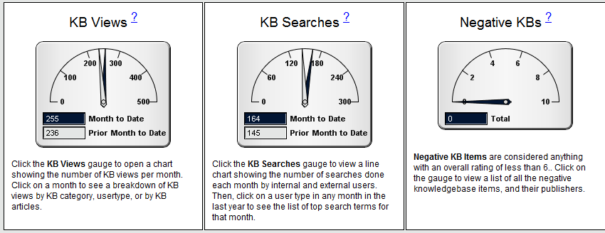
Gauges and charts are provided for things like KB views, KB ratings, payback by using the Fuze Suite, Incident volumes and handling times, contribution points earned by people for participating to improve your KB, trending of responses to survey questions and several other valuable metrics.
As they say: If you can’t measure it, you can’t manage it, and our reporting and dashboards provide critical metrics to ensure you are consistently delivering the goods.
Here's a snapshot of a few dashboard gauges: